
What Should You Include On The Homepage Of Your Website?
Sign up for a free Squarespace trial here! #afflink

It’s difficult to predict which page a first-time visitor to your site will land on.
They might arrive to your site from a link share on social media or by typing a specific keyword into Google.
We should never assume that visitors will land on the homepage of our sites, though.
This is why I like to make every single page of a site robust, with plenty of link options on each page to strategically direct traffic around the site.
What if they land on the Contact page of your site? If your Contact page only features a contact form and not much else, they might just click away. People have become very impatient on the Internet. They get bored very easily—in under 2 seconds, statistics show—so if you don’t capture their eye or curiosity quickly, or if you make them go searching for something, you might just lose them altogether.
I’m telling you all this because while this article is going to be focused on what a homepage should contain, you might also want to consider the points and ideas I’m going to discuss for all pages on your site, not just the homepage.
Designing an Effective Homepage for your Squarespace Site

A homepage should be a summary of the whole site.
Like a roadmap that directs users to and fro in a strategic way, based on your prioritized goals.
It should give a bit of detail about your other site pages—Services, About, Portfolio, Testimonials, Blog, etc.— then provide a link so the visitor can “learn more,” “continue reading,” “view your portfolio,” or “see the full gallery.”
While doing these practical things, the homepage should also visually engage visitors, preventing them from clicking away, and it should do so in a sleek non-clunky way for best load speeds.
It should preemptively anticipate questions visitors might have—here is where knowing your target audience is very important—and it should provide answers to those questions in a concise way.
Powerful & Descriptive intro sentences
Begin with an intro sentence or two that lets the visitor know what you do and how you can help them- make it concise, make it powerful.
Explain why you or your business stand out or do the job better. Let them know what you do, who you work with, how you can help them.
Take for example, my own homepage here on this site. Before a visitor has to scroll down or anything, they see this:

Not only do I design websites, but I also specialize in getting those websites to Google Page 1 using organic SEO methods. This sets me apart from many other designers. So I crafted a strong intro sentence that encapsulates the two offerings. Right away, visitors are able to know exactly what I do. They’re able to know whether this is what they were looking for, or not, before they even have to scroll a single time.
User-friendliness! Always be thinking about the user’s experience.
Faces
I think it’s a good idea to bring a solid human element to the homepage. Let people see who is talking to them!
Whether it’s your team, or just you, make that connection with good portraits or candid work shots.
Use Index Sections To Break Up The Page & Point to other pages
Personally, I only use Index Pages when designing websites. No regular pages. This is because I feel Index Pages offer more dynamic design possibilities than standard pages.
With each Index section, you can add a banner image as the background and then foreground content on top of that. With Parallax scrolling enabled, this produces a nice moving effect that most people enjoy.
Within each Index section, I will add a summary of another page, such as a paragraph or a couple of sentences, making sure to include a link or button pointing the visitor to the page in question to Learn More.
As an example, here’s a screenshot from my current homepage:
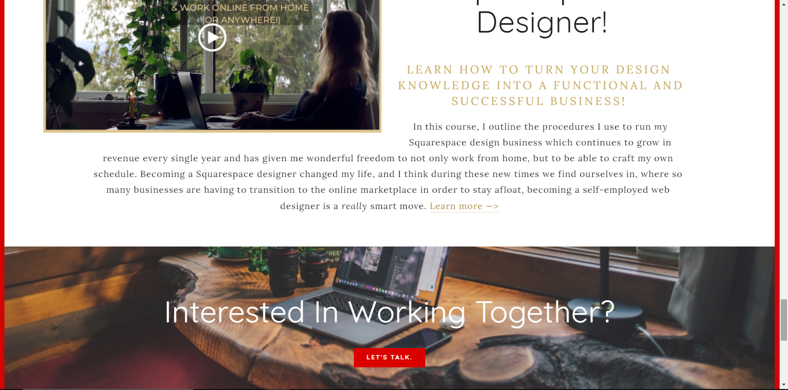
See how the top section tells a little about a course I offer, just enough to hopefully entice the visitor, then provides a link so they can go read more about it. Then the next Index section directs them to my Contact page.
You could use a Gallery Index section to direct to another page with your portfolio or a photo gallery. So on and so forth.
Sprinkle Social Proof Throughout
Testimonials are so valuable, especially on the Internet where we don’t interact face to face. Reviews from other people like you are comforting and help instill trust in visitors to your site.
So no matter what business you’re in, be sure to do good work, and then collect as many testimonials as possible.
For ideas on displaying testimonials simply and creatively, check out: 6 Ideas For Displaying Testimonials On Your Squarespace Site.

Position call to action buttons strategically
A call to action is simply a link (embedded in text, buttons, images, etc.) that directs your traffic to do something specific.
This specific action that you want your visitors to carry out might be a purchase, a newsletter sign-up, contacting you directly, and so on. Your CTA’s direction/request/instruction will depend on your business goals.
Highlight Popular Content
Using Squarespace’s built-in Analytics, you can check to see what your most popular content is, and then feature that to visitors.
To do this, login to your site, from the main menu click Analytics > Popular Content > I recommend setting the parameters to Last 30 Days, and you’ll see the pages that are most popular on your website.
The more articles/blog posts you publish, the more varied and interesting this will become. (What’s that?! You’re not blogging!? You need to be blogging…)
Provide a clear process of how to get started working with you
The last tip I recommend when designing your homepage- be sure to let the visitors know how they can work with you.
This needs to be as crystal clear as possible.
If you’re offering a service, outline in detail your process and how they can initiate working together.
If your main offering is to sell an online course, focus on that and drive traffic to the product. Sprinkle testimonials about it all around.
Just looking to make passive income with a blog? Then you need to inspire your visitors, captivate them, and make them want to read alllll of your articles. Focus on that throughout your homepage.
“Working with you” takes many forms, depending on your business/brand goals. So adjust accordingly to these tips.

Hello from a cold and windy winter maritime walk!
Hopefully this article has helped or at least provided some food for thought.
Let me know in the comments below, or email me, if you have any questions or need me to clarify anything; I’m always happy to help!
Thanks for stopping by and I’ll talk to you again soon~
x
Tiffany


Welcome!

Hey there! I’m Tiffany ~ a Squarespace Web Designer & SEO Expert. I design beautiful & professional websites that rank well on Google, & I teach courses on becoming a Squarespace SEO Expert and Starting Your Own Squarespace Design Business!
Feel free to contact me at: tiffany@tiffany-davidson.com
Sign up for a free Squarespace trial here! #afflink
My Courses:


